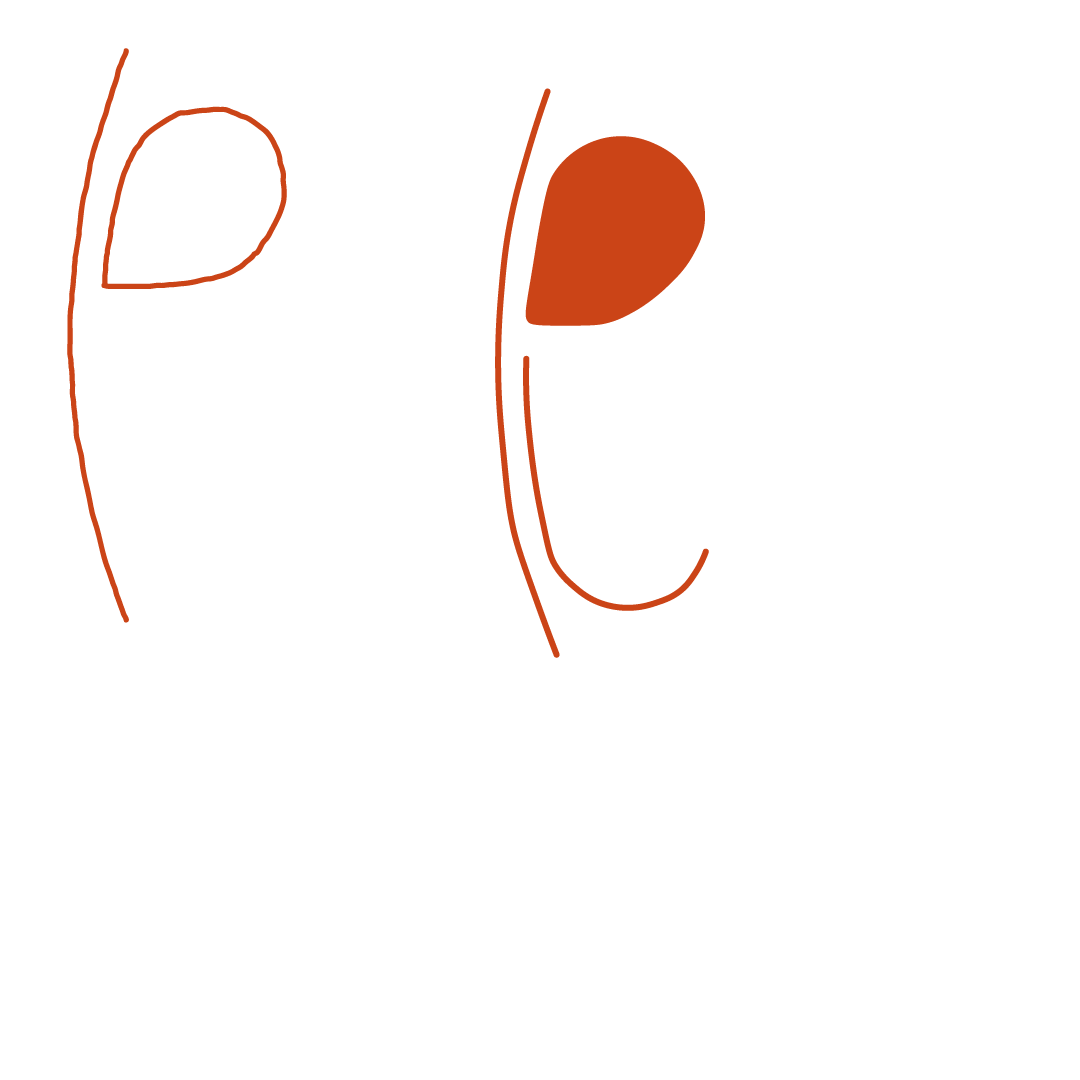
Plana joias by Ana Claudia.
Inspired by Brasilía’s ‘tesourinhas’ and its red soil, this logo and brand was born.
My aunt has made jewellery for herself and for others as gifts for a while and we thought it was time for her to share it with the world.
When starting out to sketch ideas for this brand, my initial thought was on the origin of the name itself - Plana. This has a connection to my hometown which is considered the Planalto since it is a very flat area. This inspired me to look into our city’s architecture and the lines that are already instilled into Brasilia.
These are the two landmarks that I looked at in Brasilia, the one that ended up staying - pictured in the bottom - is one of my aunt’s favourite architectural landmarks. I thus began playing around with the lines it created and connected it to the P of Plana.
From there, it was only a matter of refining lines, colours and typefaces.
These were the colours that were looked at for this jewellery brand. These were also inspired by Brasília as we are known for our red soil. As such, the bottom red became the main colour for the brand.
These next few images will be the refinement of the brand through typefaces, location and the refinement of the line and shape.


These last images will be how the final logo turned out.


